Pattern: Drop-in Components
The fastest path. The SDK renders everything — connector tiles, connect buttons, credential modals, and toast notifications. OAuth is handled automatically. You customize the look with theming and CSS variables.
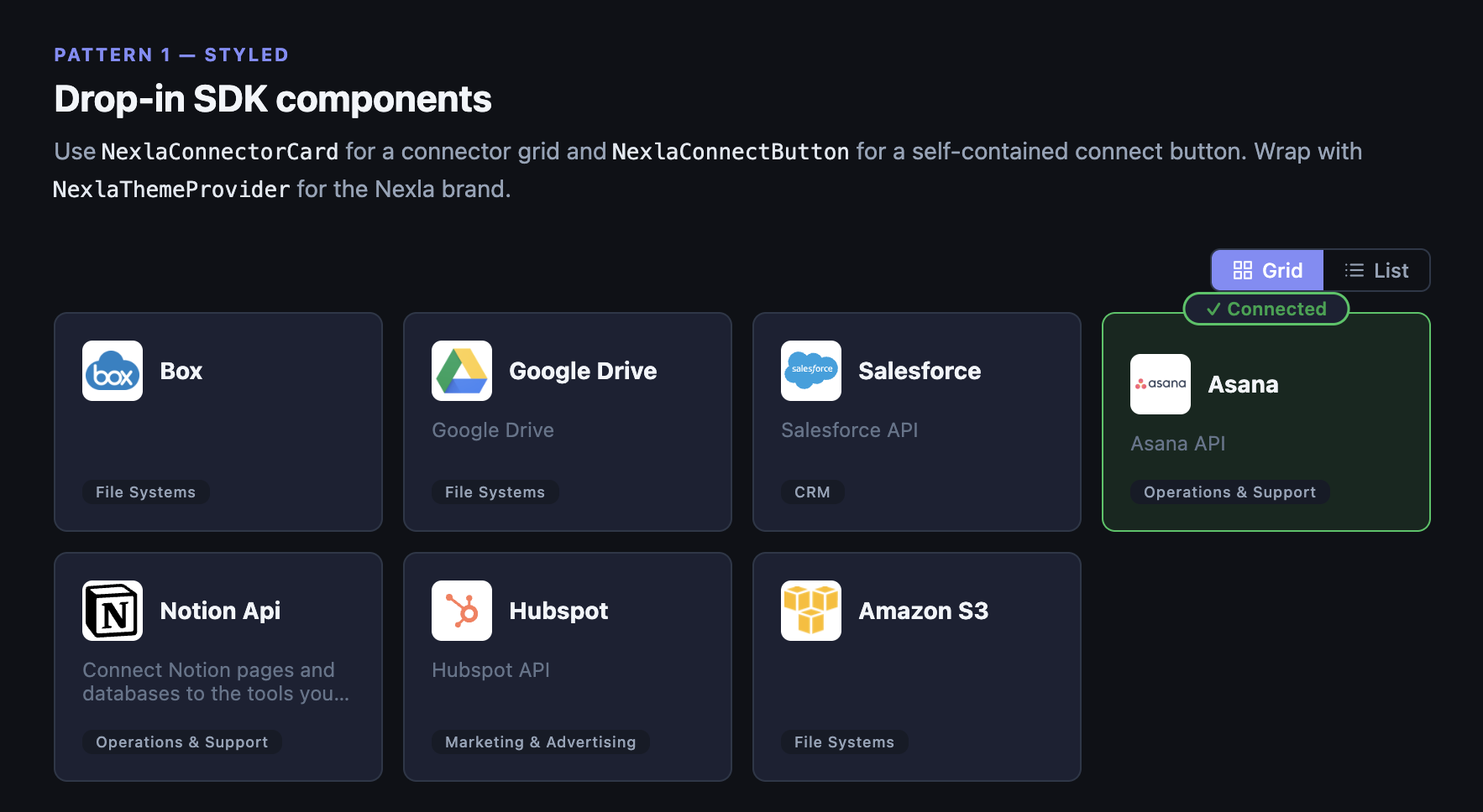
Connector grid with connected state
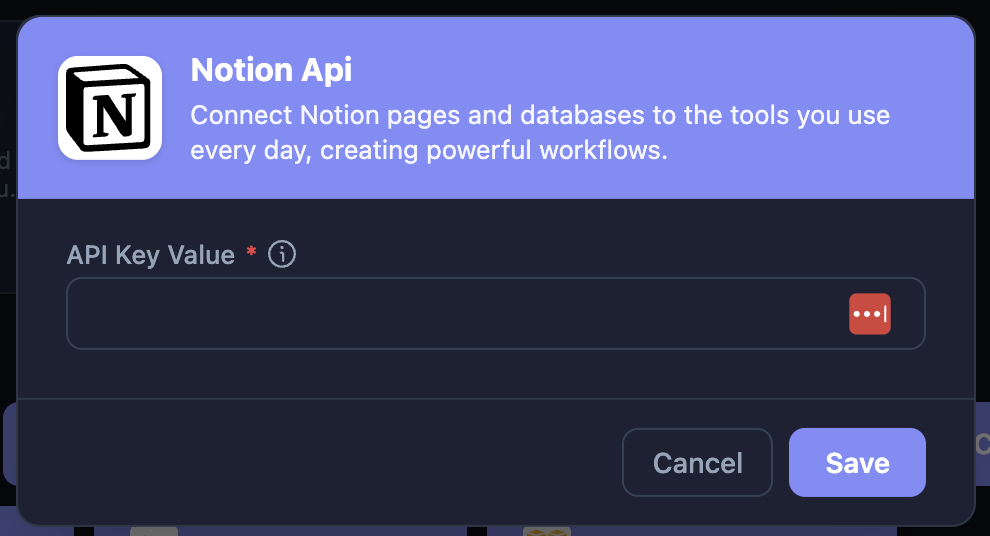
Credential modal — renders on connect
Styled components require Radix UI peer dependencies. See Installation for the list.
What you get
- Connector grid —
NexlaConnectorCardrenders tiles with logos, descriptions, categories, and connected state (grid or list view) - Connect button —
NexlaConnectButtonshows the connector logo and name; opens a credential modal on click - Credential modal — Handles everything: auth fields, OAuth popups, template selection, validation, edit mode for existing credentials
- Toast notifications —
NexlaSnackbarshows success/error/warning messages, pre-wired to SDK events
Setup
Wrap your app in NexlaConnectProvider and NexlaThemeProvider:
import {
  NexlaConnectProvider,
  NexlaThemeProvider,
  NexlaConnectButton,
  NexlaConnectorCard,
  NexlaSnackbar,
  useNexlaConnect,
  useNexlaSnackbar,
} from '@nexla/react-sdk';

function App() {
  const snackbar = useNexlaSnackbar();

  return (
    <NexlaConnectProvider
      serviceKey="YOUR_SERVICE_KEY"
      connectors={['CONNECTOR_KEY_1', 'CONNECTOR_KEY_2']}
      applicationId="YOUR_APPLICATION_ID"
      endUserId="YOUR_END_USER_ID"
      onConnect={snackbar.onConnect}
      onError={snackbar.onError}
    >
      <NexlaThemeProvider mode="light">
        <ConnectorGrid />
        <NexlaSnackbar {...snackbar.snackbarProps} />
      </NexlaThemeProvider>
    </NexlaConnectProvider>
  );
}

function ConnectorGrid() {
  const { connectors } = useNexlaConnect();
  return (
    <div style={{ display: 'grid', gridTemplateColumns: 'repeat(3, 1fr)', gap: 16 }}>
      {connectors.map((c) => (
        <NexlaConnectorCard key={c.name} connector={c} viewMode="grid" />
      ))}
    </div>
  );
}
That's it. NexlaConnectorCard renders the tiles. Clicking a card or a NexlaConnectButton opens the credential modal, which handles OAuth and form-based connectors automatically.
Customization
Theming
NexlaThemeProvider supports 'light' and 'dark' modes. It injects CSS variables you can use in your own styles:
| Variable | Description |
|---|---|
--nx-primary | Brand color (default: #5B4CF5) |
--nx-surface | Card / modal background |
--nx-border | Border color |
--nx-text | Primary text |
.my-integration-card {
  background: var(--nx-surface);
  border: 1px solid var(--nx-border);
  color: var(--nx-text);
}
Custom button labels
<NexlaConnectButton connector="CONNECTOR_KEY">
  Add Integration
</NexlaConnectButton>
Guard before connecting
<NexlaConnectButton
  connector="CONNECTOR_KEY"
  onBeforeConnect={() => {
    if (!userHasPermission) {
      alert('You need admin access.');
      return false; // cancels the modal
    }
  }}
/>
See API Reference for all component props.