Pattern: Hybrid
You design your own connector tiles and page layout. The SDK handles the credential modal — OAuth, form fields, validation, and edit mode are all managed for you. This gives you full control over how connectors are presented while keeping credential management zero-effort.
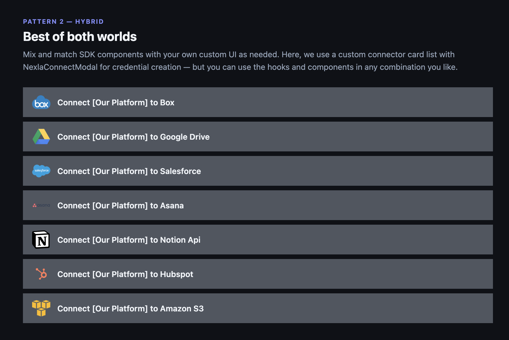
Your own connector list — design however you want
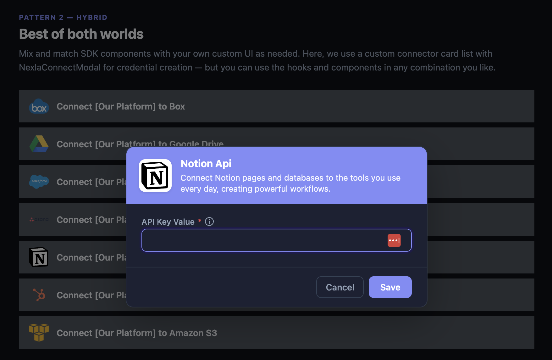
SDK modal handles credentials on click
What you build vs. what the SDK handles
| You build | SDK handles |
|---|---|
| Connector list or grid layout | Credential modal (form fields, OAuth, validation) |
| Connector tile design | Template selection for multi-method connectors |
| Click handler to open the modal | Edit mode for existing credentials |
| Page layout and navigation | Success / error feedback |
What you need to do
- Use
useNexlaConnect()to get the list of connectors and their metadata (name, logo, description, category) - Render your own connector tiles however you want
- When a user clicks a tile, open
NexlaConnectModalwith that connector key - The modal handles everything from there
import { useState } from 'react';
import {
  NexlaConnectProvider,
  NexlaConnectModal,
  NexlaThemeProvider,
  useNexlaConnect,
} from '@nexla/react-sdk';

function App() {
  return (
    <NexlaConnectProvider
      serviceKey="YOUR_SERVICE_KEY"
      connectors={['CONNECTOR_KEY_1', 'CONNECTOR_KEY_2', 'CONNECTOR_KEY_3']}
      applicationId="YOUR_APPLICATION_ID"
      endUserId="YOUR_END_USER_ID"
    >
      <NexlaThemeProvider>
        <IntegrationsPage />
      </NexlaThemeProvider>
    </NexlaConnectProvider>
  );
}

function IntegrationsPage() {
  const { connectors, credentials } = useNexlaConnect();
  const [selectedConnector, setSelectedConnector] = useState<string | null>(null);

  return (
    <div>
      <h2>Connect your accounts</h2>

      {/* Your own connector list — design however you want */}
      {connectors.map((c) => {
        const isConnected = credentials.some(
          (cred) => cred.vendor?.name === c.name
        );
        return (
          <div
            key={c.name}
            onClick={() => setSelectedConnector(c.name)}
            style={{ display: 'flex', alignItems: 'center', gap: 12, padding: 12, cursor: 'pointer' }}
          >
            <img src={c.small_logo} alt="" width={24} />
            <span>{c.display_name}</span>
            {isConnected && <span style={{ color: 'green' }}>Connected</span>}
          </div>
        );
      })}

      {/* SDK modal handles the credential flow */}
      {selectedConnector && (
        <NexlaConnectModal
          open={true}
          connector={selectedConnector}
          onClose={() => setSelectedConnector(null)}
          onSuccess={(credential) => {
            console.log('Created:', credential.id);
            setSelectedConnector(null);
          }}
        />
      )}
    </div>
  );
}
The NexlaConnectModal detects whether the connector uses OAuth or form-based auth and renders the right experience automatically. If the user already has a credential for that connector, the modal switches to edit mode.
You still need NexlaThemeProvider as an ancestor of NexlaConnectModal so the modal is styled correctly — even though your own connector tiles don't use it.
What you can customize
- Connector tile design — Use
connectorsfromuseNexlaConnect()to get logos, names, descriptions, and categories. Render them however fits your product. - Connected state display — Check
credentialsto show which connectors are already connected. - When the modal opens — Control the trigger (click, button, menu item, onboarding step).
- Post-connect behavior — Use
onSuccessto update your own app state, navigate, or trigger a data sync.
See API Reference for all modal props.
Next Steps
- Drop-in Components — Let the SDK render everything
- Headless — Full custom UI including the credential form